Accessible Colors Overview
The following provides an overview on what to check for to ensure that there are no barriers related to color in any of your content, be it a website or a Word document:
- Ensure contrast between foreground and background colors for 18 pt font and smaller is 4.5:1
- Ensure contrast between foreground and background colors for 18 pt font and higher is 3:1
- Avoid using color alone to convey information
- Avoid using Red and Black or Red and Green color combinations
- Someone with red/green color blindness will struggle to differentiate between red and green.
- Ensure text on images has enough color contrast
- Use the tools available to check color contrast and simulate color blindness
Example – Color Contrast
Note the example below on the contrast between foreground and background colors. Low contrast colors will blend together, while high contrast ones will be distinct.

Example – Text on Images
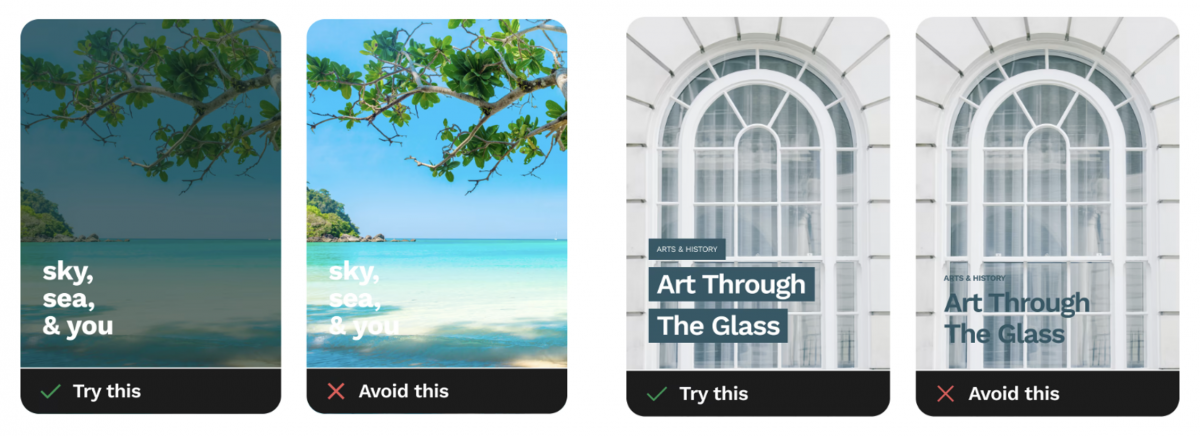
Another challenge occurs when there is text on images because the images have varying colors and brightness throughout them. It’s best to either mute the background image as shown on below the left, or as shown on the right, add a solid block behind the text to ensure there is enough color contrast.
Watch this video on accessible colors:
Contrast Checker Tools
Tools for Color Contrast
- WebAIM Website
- Contrast Grid
- Colour Contrast Analyser
- Color Contrast Pal
- Coolors
- Browser Extensions such as Web Disability Simulator
Accessibility Checkers
Word & PowerPoint
- Microsoft Office Accessibility Tool
- Review > Check Accessibility
- Blackboard Ally (HuskyCT)
- For access to a HuskyCT course, email karen.skudlarek@uconn.edu.
Websites
- Siteimprove
- For access, contact itaccessibility@uconn.edu.
- WAVE by WebAIM
- Free browser extension.
- Displays code for webpage.
PDF Accessibility Checkers
- PDF Accessibility Checker 2024 (free) for Windows only
- Blackboard Ally (HuskyCT)
- Can upload files into HuskyCT with course or organization access.
- Email karen.skudlarek@uconn.edu for course access, if necessary.
- Ally will assign an accessibility score to any uploaded file.
- Scans PDF, DOCx, and PPTx.
- Acrobat Pro
- Doesn’t check reading order or color contrast.
- Has an Optical Character Recognition (OCR) option to extract text.
- Very technical.
Accessible Colors Checklist
You can use this checklist to make sure that you are meeting the requirements for color contrast and other accessibility barriers related to colors.
Accessible Colors Checklist
- 18pt font or higher has a 3:1 contrast ratio.
- Font size below 18pt has 4.5:1 contrast ratio.
- Labels and icons are used with color to convey information.
- Red/black and red/green combinations are used cautiously.
- Text color is distinguishable from images colors.
- Tools were used to check color contrast and simulate color blindness.