Recommended Self-Paced Trainings for Website Admins
- Introduction: What is digital accessibility and why it matters, who is impacted by accessible digital content.
- Colors: Why color is important and how to ensure adequate contrast.
- Images: What is in an image and how to make it accessible.
- Video & Audio: The importance of captions and transcripts.
- Websites: The various elements of a website and how to make them accessible.
Whether you’re a website admin or editor, there are key accessibility principles you must be aware of in adding content. Many of these practices will overlap with each other as well as the content creator role.
Understand the key accessibility information you need to know:
- Color Contrast
- Images
- Titles & Headings
- Readability
- Descriptive Hyperlinks
- Navigation Order
- Layout & Grouping
- Multimedia Content
- Forms & Messages
Skip to External Resources for creating accessible websites.
1. Color Contrast

Ensure text is distinct from background color for adequate visibility. Aim for baseline contrast ratio of 4.50:1 while also considering color blindness.

Use dark colors on light-colored backgrounds or vice versa. Some color combinations should be avoided for color blindness like red and green.
Avoid relying on color to convey meaning to prevent visually impaired users who struggle to perceive colors from understanding the content. Add labels or icons to assist a color’s meaning. Learn more about color blindness through Colour Blind Awareness. or deepen understanding in Colors module of Self-Paced Learning.
2. Images
Ensure alternative text is added to all image-based elements unless it lacks meaning. Mark any meaningless images as decorative if possible. The description should be concise and avoid repeating information near the element.
When writing alt text, leave out phrases like “Image of” or “Chart of” that is already announced by screen readers. Screenshots may be written into the alt text. Learn more about alt text in the Images module of Self-Paced Learning.
3. Titles & Headings

Titles for websites are distinct with one defining brand name and the other identifying each page. The website title receives its own <title> tag that is located in the header section, while the webpage titles are tagged as a single <h1> elements found in the main body.

Proper heading tags is important for both visual cues and screen readers. These typically come in the form of tags (H1, H2, etc.) or styles (Heading 1, Heading 2, etc.). Use only one H1 tag per page and maintain heading hierarchy from H1 to H6.
4. Readability

It’s also important to be mindful of font choices that have their own sizing. A typical sans-serif font like Arial or Helvetica may appear smaller with a unique one like Grotesque or Ubuntu.

Fonts and their size dictate much of a website. Small text is difficult to read but excessively large can be equally uncomfortable to see. A good rule of thumb for minimum sizing is 12pt or 16px.

To improve the readability of your website, use spacers to create room between sections, add line height for easier scanning, and increase letter spacing based on font choice.

Keep text aligned to the left on body text to maintain consistent reading patterns, avoiding justified alignment to prevent awkward spacing. Center alignment should be reserved for headings and short strings of text if you choose to implement it.

Supplement word-heavy sections by including meaningful images for visual space. Try to write plainly and define acronyms or jargon as needed. A comfortable reading width is around 60-100 characters or less than 15 words per line.
5. Descriptive Hyperlinks

Display and alt text should describe a link’s purpose and destination to provide clarity for everyone on its inclusion within a file. Links ideally have their own distinct color from other text with an underline.

A screen reader may give its user a list of all links within a file, so its important text is utilized to convey meaning. Key words are very helpful in identifying a link’s destination as well as its purpose. An example of a descriptive hyperlink is IT Accessibility at UConn.
6. Navigation Order

Files with proper alternative text, correct heading semantics, and logical reading order help screen readers announce information to users as intended and makes it easier for users to keyboard tab through a file.

Be mindful of the order elements are added in presentation or design files as elements can be read out of sequence by screen readers and cause navigation difficulties with keyboard users.
7. Layout & Grouping

Maintain flexibility between mobile, tablet, and desktop versions when adding information. Important information should not become obscured as screen sizes change elements or shift position. Be mindful of fixed or sticky positioning that may obstruct meaningful information on a page.

Layouts with more than two columns stack on mobile as you design on desktop. If there is content that relate to each other, group them together so screen readers and keyboard users to easily digest information.
8. Multimedia Content

Any video content in a file needs to include captions or subtitles and a transcript. Audio descriptions for videos should be used when on-screen actions contribute to meaningful understanding of the content. Captions must be accurate and synchronized appropriately. For audio-only content, a transcript is sufficient.

Including these various formats in multimedia allows a much wider audience to consume the content, particularly users who have auditory conditions or prefer reading information. Learn more about multimedia accessibility in the Video and Audio module of Self-Paced Learning.
9. Forms & Messages
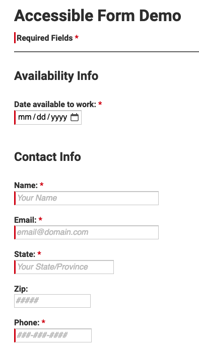
An ideal form that is both visually interesting and accessible will typically have a single-column layout unless fields directly relate to each other. The form’s input fields should be distinguishable from the background with clearly labeled field names regardless of user action. Additionally, required fields need to be marked appropriately with an asterisk and a descriptor or bluntly stated as required.


Messages are a great way to provide feedback to a user in real time. A combination of color, icons, and text is often used near the field. It’s practical to show error messages promptly as the user completes the form. If they appear only after submission, it may be difficult to figure out which field is displaying the error, especially in the event of a long form. Any instructions should be written clearly and plainly.
There are some other best practices to keep in mind when creating an accessible form. The following is mainly applicable to long forms:
- Use progress indicators for multi-page or single-page forms.
- Segments, percentages, bars, and even page numbers are a few options.
- An option to save and return to previous pages is ideal for checking work.
- Important for unstable internet connections or navigating away from the page.
- Timed forms should be specified, along with an option to extend time.
- Every user is different, so completion times are often varied.