When creating documents, there are a few steps that can be followed in order to make your content as accessible as possible. Please keep in mind that these steps are for the creation of .docx files, not for .rtf files. .rtf files cannot be made accessible without removing all images, because alternate text cannot be added to images in .rtf files. Please keep this in mind when choosing your file format.
- Overview
- Setting Document Title/Author
- Accessible Fonts
- Headers and Styles
- Descriptive Tagged Hyperlinks
- Blank Templates
- True Tables
- Avoiding Justified Format
- Steps for Checking Accessibility
- External Resources
Overview – Improving Word Accessibility
The following serves as an overview of the main considerations and actions to take to improve the accessibility of your Word documents
- Add a document title and author.
- Use accessible fonts (sans serif) like Arial, Calibri, and Verdana.
- Ensure alt text and adequate color contrast in the document.
- Hyperlinks should be descriptive.
- Include headers and styles,
- True tables need to have headers.
- Avoid justified (centered) formatting for consistency.
- Use accessibility checkers.
- Create PDFs from copiers.
Accessible Word Checklist
Use this checklist to make sure that you’re meeting the accessibility requirements for Word documents:
Accessible Word Checklist
- Presence of document title and author.
- Accessible fonts like Arial, Calibri, Verdana were used.
- Navigation pane was open to guide users.
- Alt text exists for images and tables.
- Clear headers and other styles with adequate color contrast.
- Hyperlinks are descriptive.
- True tables includes headers using repeat header row.
- Check accessibility with Office and/or Blackboard Ally.
Setting a Document Title/Author
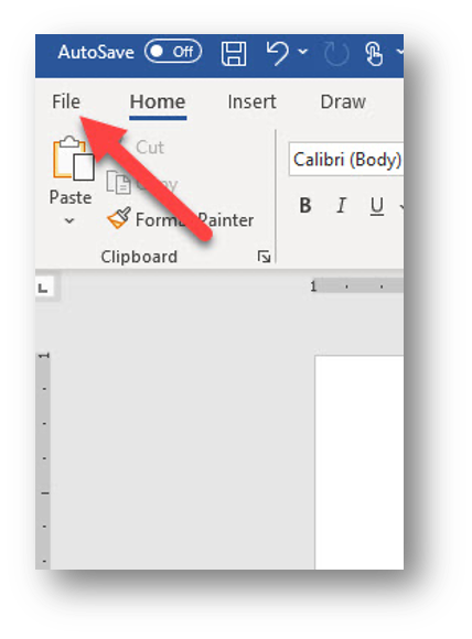
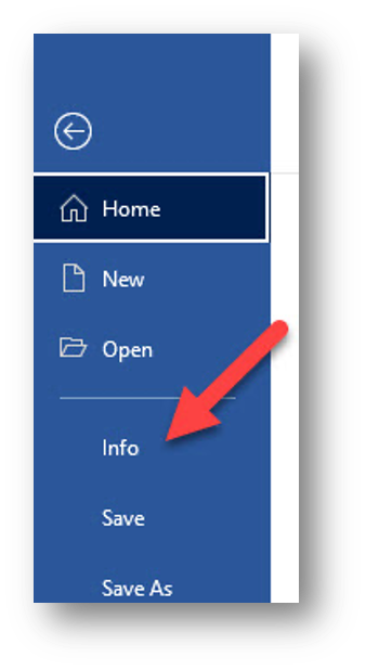
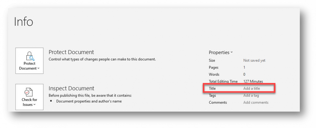
If a file doesn’t have a title, its filename will be used instead. Filenames often include acronyms or abbreviations, which can be confusing when read by a screen reader. To ensure accessibility, every file—such as Word documents, PowerPoint presentations, Excel spreadsheets, and PDFs—must have a proper title. Click File > Info and include a title.
Accessible Fonts (sans-serif)
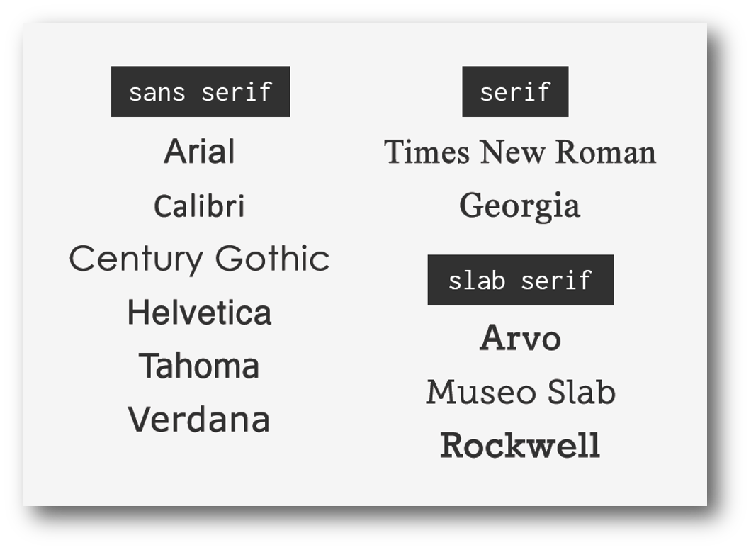
Use accessible fonts, such as sans-serif. Serifs are small strokes at the ends of letters. Sans-serif fonts don’t have serifs making them easier to read and more accessible. This improves legibility for people with visual impairments, dyslexia, or cognitive disabilities and ensures text displays clearly on screens. Some examples are Arial, Calibri and Verdana.
- Use font size 12 or higher.
- Bold with Strong style.
- Italicize with Emphasis style.
- Good choices are:
- Arial
- Calibri
- Verdana
Headers & Styles
Headings provide structure and organization to a document, making it easier for screen readers to navigate. They allow users with visual impairments to jump between sections quickly instead of reading line by line. Proper heading styles (Heading 1, Heading 2, etc.) create a logical hierarchy that improves readability and ensures that assistive technologies can interpret the document correctly. There is only one heading one in any file or webpage. The main sections are heading twos and subsections are heading threes.
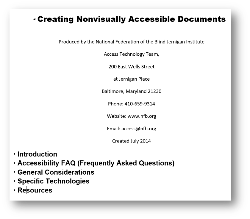
Tip: Turn on Navigation Pane in Word to see the structure. Click on View in the Ribbon and turn it on under Show section
Headings in MS Word
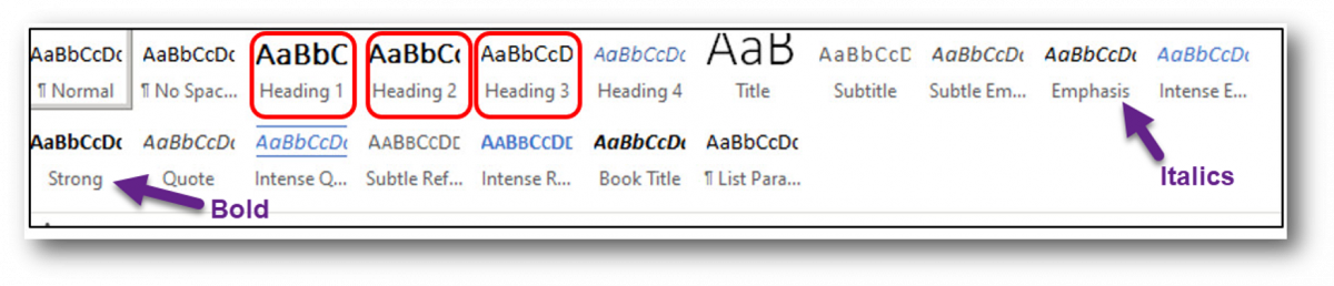
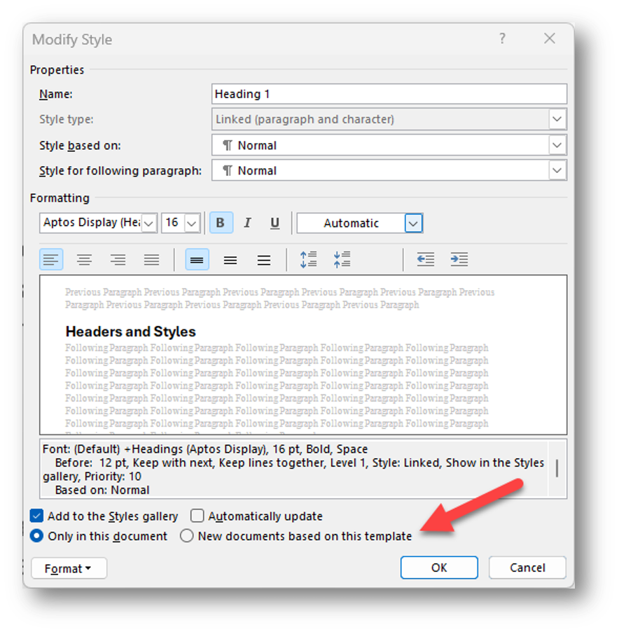
The headings are found in the ribbon under styles. A heading can be modified by right mouse clicking on it and click update heading to match selection or click modify. Using the styles emphasis for italics and strong for bold is important because they provide visual cues that help convey meaning and structure. Screen readers announce these styles, allowing users with visual impairments to understand which text is highlighted or emphasized. Avoid clicking the I or B shortcut icons in the ribbon because they don’t apply the style required for screen readers.
- Use the Styles found in the Home tab of the Ribbon.
- Right-click on “Heading” in the Styles panel to modify its format.
- Emphasis Style is for italics and Strong is for bold.
Descriptive Tagged Hyperlinks
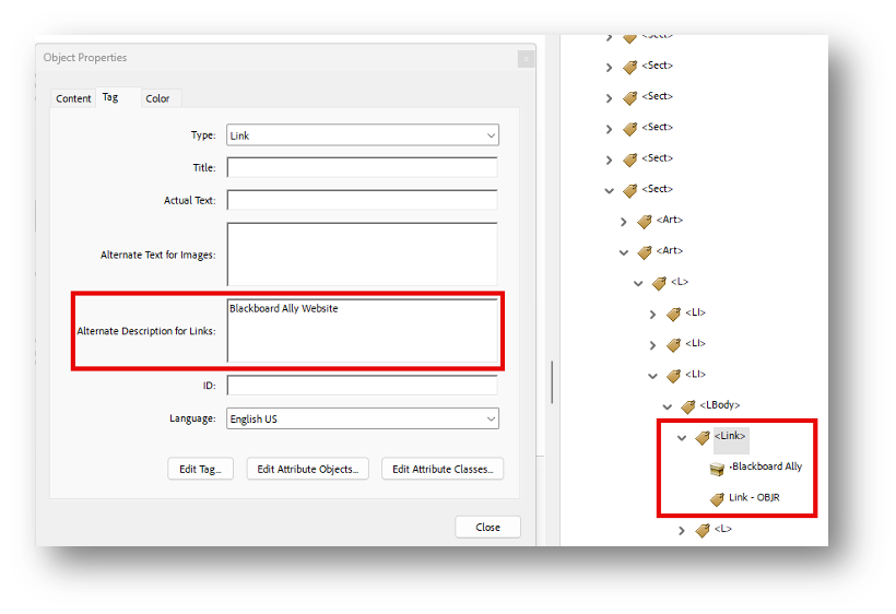
Sighted users can visually scan a document or webpage to identify links, which are usually bold and underlined. Users who are blind rely on screen readers and navigate by pressing the Tab key to move through links. Screen readers only announce the link text, not the surrounding content. If a link says “Click here,” the user has no idea where it leads. Instead, use descriptive link text, such as “Download the Accessibility Guide.”
This is important: Do not underline text that isn’t a hyperlink. Sighted users who can’t use a mouse and can only navigate with a keyboard may assume it’s a link and try to tab to it, which can cause confusion.
- Screen reader users navigate websites tabbing link to link.
- Write text display to indicate link page.
- Do not use “click here,” “learn more,” “read more” as text display.
- Example:
- BlackBoard Ally
- Don’t underline text that isn’t a link.
- Keyboard only users may think it’s a link and can’t access it by tabbing.
Inaccessible File – Example
This example has no headings. Sighted readers can quickly scan a document by looking for headings, which are usually bold and larger than the surrounding text. Without headings, finding specific information becomes difficult and may require reading the entire document. For someone using a screen reader, the experience is similar: they rely on headings to navigate by listening. If headings aren’t used, they must listen to the entire document to find what they need.
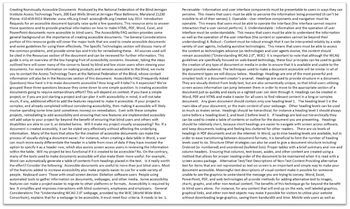
This file has far too many words in a huge block with no line breaks.
Blank Templates: Normal.dotm
When you open Word and start with the Blank template, it uses the Normal.dotm file. If you modify any Styles in this template and choose “New documents based on this template,” those changes are saved to Normal.dotm, affecting all future blank documents. If you need different heading styles for various types of documents, such as a meeting agenda, you can create custom templates instead of changing the default.
- Blank templates in Word open as Normal.dotm files.
- Select “New documents based on this template” to apply Style changes.
- Create custom templates using different Heading Styles for various documents.
True Tables
When creating accessible tables, start by using tables only for data—not for layout purposes. Always designate the first row and, if needed, the first column as headers. The top row should contain column headers, and the first column should contain row headers. Make sure to turn on the “Repeat Header Row” option so headers remain visible when scrolling.
Add alt text to the table to describe its purpose and content for screen reader users. Finally, avoid split or merged cells and nested tables because these become inaccessible when the document is saved as a PDF. If they’re created, you must use Acrobat Pro to remediate the table in the file.
True Tables Best Practices
- Use only data for tables
- Designate the first row and/or column as headers.
- Top row should be column headers.
- First column should be row headers.
- Be sure to turn on Repeat Header Row.
- Add alt text to the table.
- Split or merged cells and nested tables are inaccessible in Word.
- Must use Acrobat Pro to remediate.
- Check tab navigation (left to right and down).
True Tables Example
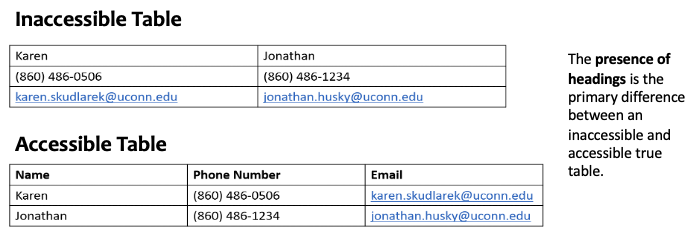
Here are two examples of tables. The first is inaccessible because it was used only for layout purposes and doesn’t contain headings. Tables are read from left to right and down. If this table had more rows, it would be very difficult to understand which phone number is associated with which person. The table below it is accessible because it has headers and the data is same for each column making it much easier for someone with a screen reader to access the data.
Avoiding Justified (Center) Format
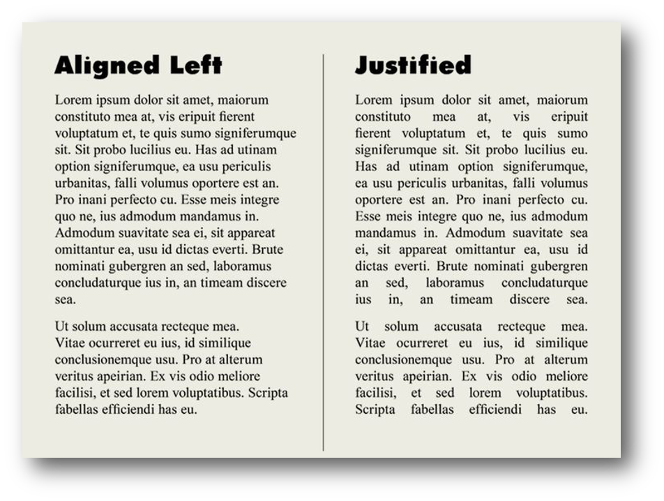
Avoid using Justify format for paragraphs. Although it allows the text to appear as a single block with perfect margins, it also creates inconsistent spacing, which can force the reader’s eyes to “jump” when reading.
- This becomes a serious issue when using assistive technologies such as screen readers.
- Many people with vision disabilities use screen magnifiers or enlarge web content by “zooming in” on the page.
- If text is justified, these users may see large, empty spaces between (or within) words — or the words may run together in a confusing mess of characters.
- Fully justified text can create uneven spaces between words and letters, making it difficult for those with dyslexia.
- Makes text visually appealing with perfect margins but creates inconsistent spacing.
- Assistive technologies (AT) like magnification will expose considerable white space.
- Can cause disarray between words and characters.
Steps for Checking Accessibility
Using Check Accessibility Tool
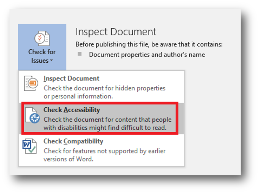
Use the Accessibility Checker in Microsoft Office applications, located under the Review tab by selecting Check Accessibility
MS Word Forms
Add the Developer tab to the Word ribbon:
- Navigate to File > Options > Customize Ribbon
- Check the Developer checkbox
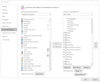
Add form elements:
- In the Developer tab, in the Controls panel, insert Legacy Form Fields from the drop down
- Examples of Legacy Form Fields include Text form field, Checkbox, and Drop-Down
- To add ActiveX Controls, enter Design Mode in the Controls panel and insert ActiveX Controls
- Examples of ActiveX Controls include Option buttons and Combo boxes
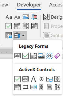
Add help text to legacy form fields:
- Select the form field and select Properties OR right click on the field and select Properties
- Select the Add Help Text… button
- Under Help Key (F1), type help text into the textbox
- The help text might be the same as the form field’s label; for example, if the field is for the respondent’s first name, the help text might read “First Name”. If the field asks for a user’s experience, the help text might read “Give an example of your experience”.
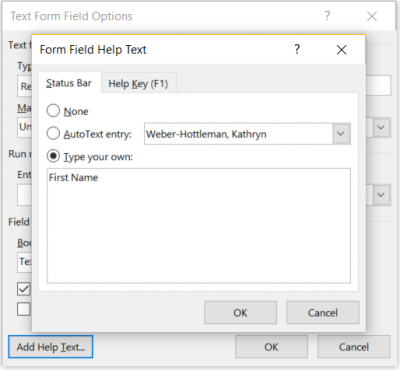
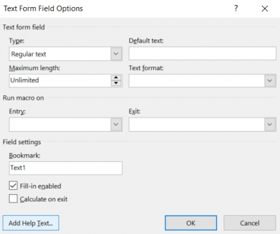
Add help text to ActiveX Controls
- Enter Design Mode under the Developer Tab, in the Controls pane
- Insert the ActiveX control into the page
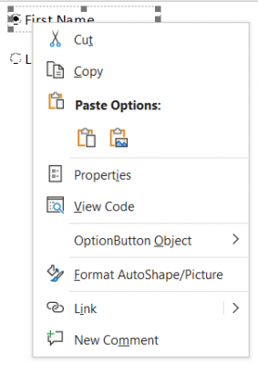
- Select the form field and select Properties OR right click on the field and select Properties
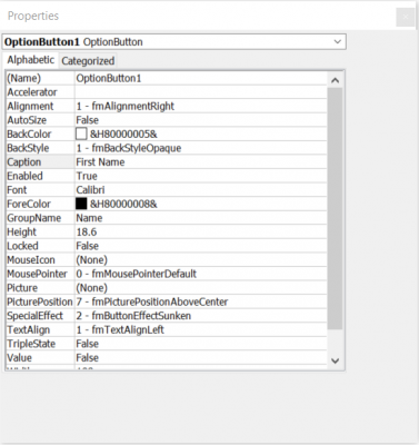
- In the Properties panel, change the Caption and the Group Name
- The caption is what will display next to the ActiveX control
- The group name describes the objects that are grouped together. For example, fields for first and last name may have a group name of “Name”. The group name prevents multiple options within the same group from being activated, so this is particularly useful for radio or option buttons
- Close the Properties panel
- Exit Design Mode to make the controls available to users
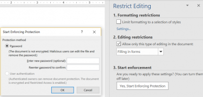
Restrict editing to make the form work with assistive technology, like screen readers:
- On the Developer tab, select Restrict Editing
- Under Editing Restrictions, check the box next to Allow only this type of editing in the document:
- In the drop down, choose Filling in forms
- Activate the Yes, Start Enforcing Protection button
- Enter a password (optional)
External Resources
- Microsoft Office
- Review > Check Accessibility
- Turn on Navigation Pane.
- HuskyCT/Blackboard Ally
- For courses and websites.
- PDF/UA PDF Checker 2024
- More technical but provides insight into issues needing remediation.