- Introduction
- Website Manager Principles
- Website Developer Principles
- Website Developer Applying Principles
- Accessibility Audit Methodology
- External Resources
1. Introduction
There are four basic principles for accessible web design:
- Perceivable: Ensuring all aspects of your site can be viewed by people with disabilities, such as captioning and alternate text for images.
- Operable: Ensuring any user controls can be operated by those who do not use a mouse, such as keyboard accessibility and focus.
- Understandable: Ensuring content is consistently and clearly described, such as navigation, error messages, and identifying languages used in the webpage.
- Robust: Ensuring content acts similarly, regardless of browser or assistive technology, such as accurate and complete HTML.
Refer to Information Technology Services (ITS) for assistance regarding website development. If your site is deployed through Aurora, visit the Aurora Accessibility page and the Aurora guides for more information.
Watch this video on creating accessible websites:
2. Website Manager Principles
Features
- Headings create recognizable visible and programmatic landmarks on a page.
- Some users who access websites and documents use assistive technology to take in the programmatic information headings provide and quickly navigate content.
- Think of it as getting heading information through sound or touch, instead of through sight.
- Assistive technology users can jump from heading to heading similar to visual users.
- Using headings in order (
H1,H2,H3,H4, etc.) helps all users quickly grasp the page’s structure.- Visually, heading levels convey different information based on font size or weight.
- Structurally, heading levels also convey the same information to assistive technology users.
- Example: Announcing that a heading is level four indicates that it is likely not as important as a heading level one (which is typically the biggest, boldest heading).
Solutions
- Use preformatted headings.
- Use headings in order, if possible.
- Check that programmatic headings match visual headings.
Features
- Accessible media provides information with which all users can engage.
- Some users can take in audio and visual information, and other users cannot see, hear, or otherwise engage with media unless it is accessible.
- Accessible media includes alternate text for all images, transcripts for all audio-only media, textual or audio description for all video-only media, and captions for all videos with sound.
- Alternate text and descriptions of video-only media provide information for individuals with low to no vision.
- Typically, these descriptions are accessed via assistive technology in the form of a screen reader.
- Transcripts and captions provide users who are deaf or hard of hearing with information by allowing them to visually gather information presented via sound.
Solutions
- Use only videos with captions available.
- To learn how to caption a video yourself, visit the Video & Audio module for captions and subtitles page.
- Describe images accurately, including any important text that appears in the image in your description.
- Think about how you would describe an image and use this as the basis for your alternate text.
- Consider using the Caption feature in Aurora or having a descriptive paragraph for long descriptions.
- Describe all audio-only media, either in a transcript or in an accompanying paragraph.
- Example: If the audio is just a sound, like a lion roaring, the description would be “lion roaring”.
Features
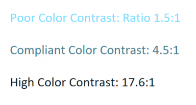
- Adequate color contrast provides users with low vision or color blindness with accessible information.
- If foreground to background color contrast is below 4.5:1, some users will miss information because they are unable to differentiate between the foreground and background colors.
- Color dependence relies on color only to convey meaning. This causes problems for colorblind users or users with low vision who may be unable to see color-based cues and will thus miss important information.
- High Color Contrast: UConn’s logo (white on UConn blue) has a foreground to background color contrast ratio of 14.46:1.
- For comparison, pure white (#FFF) on black (#000) has a perfect contrast ratio of 21.0:1.

Solutions
- Check all content for color contrast before publishing.
- Example: Before publishing a promotional poster, check the foreground and background colors, especially text, for contrast levels.
- Use a contrast checker to ensure sufficient contrast.
- Avoid creating elements that rely on color to convey information.
- Example: When designing images or interactive content, avoid phrases like “select the yellow item” or “all items in red are required”. Instead, say “select the yellow star” or “all bold red items are required”.
Features
- Many widgets and plugins are not accessible, which means that users with disabilities cannot use them or access the information they provide.
- Example: A photo viewer may not be keyboard accessible, so users who use the tab key to move through sites cannot advance through images.
- It is necessary to test each widget or plugin in a particular site due to potential for uniform behavior.
- Example: The countdown widget, which has to be displayed in a page to fully test it for accessibility.
- ITS has a list of approved widgets and plugins which have been tested for accessibility. Please contact itaccessibility@uconn.edu if you would like a widget or plugin tested for accessibility.
Solutions
Features
- Essential for users who are blind, have low vision, or have limited mobility.
- Both users who are blind or have low vision and users who have limited mobility or strength access information via keyboards.
- Navigation typically uses Tab or arrow keys; activation of interactive elements use Enter or Space.
- If your site requires unusual keyboard commands, clearly inform users.
- Widgets and plugins must also be keyboard-accessible or they create inaccessible gaps.
- Best Practice: Group related elements (e.g., image + link) under a single tag to reduce redundant tab stops.
- Example: If an image and a link both lead to the same place, consider grouping them under the same
<a>tag.
- Example: If an image and a link both lead to the same place, consider grouping them under the same
Solutions
Potential solutions for creating keyboard accessibility.
- To check tab order, open the selection pane (documents and presentations) or tag tree (PDFs) to reorder elements of the page.
- If necessary, reorder elements to make the tab order more logical.
- Example: If there are 3 text boxes on a page, determining the logical tab order dictates the order in which a screen reader reads the text boxes.
3. Website Developer Principles
Providing a visual representation of where a user is located on a page.
- Avoid relying on color to convey information, ensuring that the visual representation is not solely indicated by color change.
- Example: Giving
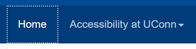
a:hoveranda:focusa border style attribute of dotted and border width of 1 pixel, with a border color that contrasts well with the background. - Example: Showing that a user is located on an icon through the icon’s movement; an icon might appear to float upward instead of changing color.
- Example: Giving
Setting up a page so that a user can tab through all interactive elements on the page, including widgets.
- No information conveyed only through mouseover (title attribute). If a user cannot hover on an element, they will miss the information shown in the mouseover.
- All controls must be able to be accessed through the keyboard, typically through hitting ‘tab’.
- Best Practice: Minimize the number of times a user has to hit tab by grouping related objects under one tag.
- Example: An icon and its text should be grouped together.
- Example: A user must be able to tab to an image carousel’s controls.
Allows users to bypass repetitive elements of a page.
- Just as sighted users visually skip over the navigation to a page’s content, this allows non-sighted users or keyboard access users to do the same.
- Also called a “skip nav” because the navigation bar is often the repetitive element of the page.
- Best Practice: Make it obvious that a skip link is present by having it visible when it receives tab focus.
- Example: uconn.edu’s skip link appears when it receives tab focus.

Provides users with low vision or color blindness with perceivable content.
- Like color dependence, avoids providing information in a way that is not able to be apprehended by all users.
- If foreground to background color contrast is below 4.5:1, some users will miss information because they will not be able to differentiate between the foreground and background colors.
- Example: UConn’s logo (white on UConn blue) has a foreground to background color contrast ratio of 14.46:1.
- For comparison, pure white (#FFF) on black (#000) has a perfect contrast ratio of 21.0:1.
4. Website Developer Applying Principles
- Enable sticky links.
- Activate all navigation items on tab or enter.
- Show visual focus through borders.
- Declare names, roles, states, and values if using ARIA attributes. These provide information a sighted user would see to screen readers.
- Otherwise can use
altfor images.
- Otherwise can use
- What you see is also in the code, so visual and programmatic labels should match.
- Set labels using ARIA attributes or through
fieldsetandlabel. - Set accurate titles for any frame or
<iframe>.
- Set labels using ARIA attributes or through
- Declare the document’s language. This signals screen readers to choose an appropriate voice and accent.
- If a language other than the document’s default is used, declare the appropriate language.
- Keep the page “clean” and usable even when CSS is disabled. Some users disable a site’s CSS and impose their own stylesheet for easier viewing.
- Example: On some pages, when CSS is disabled, a toggle navigation button appears; the toggle navigation was designed for mobile viewing but could be confusing on a web page.
- Example: When CSS is disabled, image carousels tile images and loop the user back to the section of the page where the images are displayed on every image change.
- An accessible stylesheet is available and can be applied to any site.
- Many widgets and plugins are not accessible.
- Example: All Flickr widgets are inaccessible.
- It is necessary to test each widget or plugin in a particular site because they can have behavior that spreads throughout a site.
- Example: Countdown widgets’ behavior has to be displayed in a page to fully test for accessibility.
- ITS has a list of approved widgets and plugins, which have been tested for accessibility.
5. Accessibility Audit Methodology
Website Developers & Website Managers
Instructions
- Look through the page for audio.
- Do all audio files have a transcript or text description?
- Think: If an audio file is just sound effects, like lion roaring, there is textual description of the sound saying “Lion roaring”.
Solution
If the audio file does not have a transcript or text description, add a transcript or other textual description. For example, if an audio file is just sound effects, like lion roaring, there would be a textual description of the sound saying “Lion roaring.” A transcript can be added as a link to a document or as a paragraph following the audio file.
Instructions
- Open ANDI and navigate to Color Contrast.
- Use the forward and back arrows to move through all color elements and view the contrast ratio.
- Is the color contrast ratio greater than 4.5:1?
- If the ratio is lower than 4.5:1, use Color Contrast Pal to determine a color combination that raises the ratio.
- Look at Accessibility Alerts to determine where manual testing is necessary.
- For manual testing, use a contrast checker to review contrast.
Examples of Color Contrast
Solution
If the color contrast of text’s foreground to background colors is lower than 4.5:1, adjust the colors until the text has a contrast ratio of at least 4.5:1. Use a color contrast checker to determine a color combination that raises the ratio.
Instructions
- Look through the page for all places where color is used
- Example: Navigation bar, where color may be used to show hover or focus on a link
- Example: Links, where color may be used to show hover or focus on a link or to differentiate the link from other text
- Are there areas on the page where information is only provided by color?
- If the page was rendered in grayscale, is any color-based information lost?
Example of Color Dependence
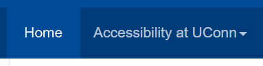
Example of Focus
Solution
If there are areas where information is only provided by color, add an additional way to present information to users. For example, instead of saying “All red items are required,” amend to “All red items with an asterisk are required.” The asterisk provides a non-color dependent way of showing which items are required.
Instructions
- Open ANDI and navigate to Tables.
- Note: This option will only appear on pages where tables are detected. If your page does not have tables, this option will not be available.
- Under Tables, select Markup.
- Look at table cells’ markup to see their attributes.
- Are all row and column headers programmatically identified?
- If a complex data table is present, are its data cells programmatically associated with its headers?
- Are there images?
Solution
Cells would likely be programmatically identified by the program where the table was created. If creating a table in Aurora, edit the Table Cell Properties and define the cell type as Header and the cell’s scope as row or column. Refrain from using images of data tables, as these will always be less accessible than the original table.
Instructions
- Open ANDI and navigate to Focusable Elements.
- Click on label tags.
- Tab to or hover over each form field to see the field’s label.
- Does the label clearly indicate the field’s purpose?

Solution
Provide descriptive text with complete instructions and cues for each form field. In Aurora, fill out the Field Label with descriptive text. For example, a field asking for the user’s first name would have a field label of “First Name”.
For form controls, provide labels that identify the control’s purpose. In Aurora, under Form Settings and Form Button, fill out the Button text with a description of the button’s purpose. For example, a button submitting the form would have Button text reading “Submit”.
Instructions
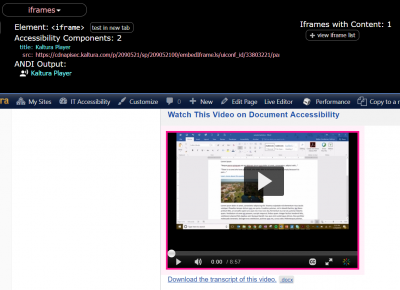
- Open ANDI and navigate to iFrames.
- Note: This option will only appear on pages where iframes are detected. If your page does not have iframes, this option will not be available.
- Is each iframe’s Title or Name descriptive?
- Is each frame’s Title or Name descriptive?
Example of frame attributes shown through ANDI:
Solution
If using frame embeds of <iframe>, provide a title or name by editing the embed code to include the title="" attribute. Within the embed code, add title="Name".
Instructions
- Open ANDI and navigate to Graphics/Images.
- Use the forward and back arrows to move through all graphics and images and view the ANDI Output.
- Does each image have an ALT, a TITLE, or ARIA attributes?
- Do all meaningful images (not decorative images) have equivalent text that describes their purposes and functions?
- Do all images containing text have the same text in the ALT?
- If there are CAPTCHA or reCAPTCHA images in the page, do they have an ALT describing their purpose?
- Is there an alternate way to access them?
Solution
Every image should be provided with alternative text, also known as the alt attribute. If using Aurora, go to the Media library and select an image. Under Alternative Text, enter text that describes the image’s form and function. Be sure to include all text shown in the image in the alternative text. For example, an image of the UConn logo should have an alt that reads “UConn University of Connecticut logo”.
For decorative images, or images that do not add any meaningful information to a page, the alternative text should equal “”, a pair of double quotes. This signals to a screen reader that it can skip over this image. For example, a stock image used to give a page visual interest could have alt="".
If there are CAPTCHA or reCAPTCHA images on the page, they also must have an alt describing their purpose and an alternate way to access them. For example, some CAPTCHAs offer an audio version.
Instructions
- Open ANDI and navigate to Links/Buttons.
- Use the forward and back arrows to move through all links and buttons and view the ANDI Output.
- Do all links have unique, meaningful names describing their destination or function?
- Example: “Learn more about web accessibility” instead of “Learn more”.
- If a link reroutes to another page or site, does the link have a unique, meaningful name describing its destination?
- Example: “Read the rest of this article about web accessibility” instead of “Read more”.
Solution
Provide each link or button with a unique, meaningful name that describes its destination or function. For example, a link’s text might read “Learn more about web accessibility” instead of “Learn more”.
Instructions
- Look for all multimedia (synchronized audio and visual) on the page
- For each piece of multimedia, ask the following questions
- Are synchronized captions provided?
- Are the provided captions accurate?
Example of Multimedia
Solution
Create captions for each piece of multimedia (synchronized audio and visual). Captions must be accurate or users will be provided with misinformation. Captions can be created using Kaltura, YouTube, or 3Play Media.
Instructions
- Look at the page to determine if plugins are required to access any information.
- Is the link to download a required plugin provided?
- Example: A page may have links to required plugins in the footer.
- Is the plugin itself compliant?
- Note: You may have to review the plugin separately for accessibility.
Example of plugins notice:
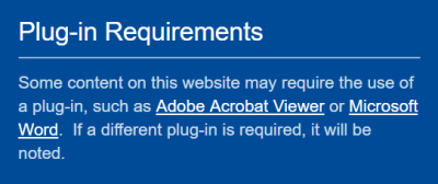
Solution
If plugins are required to access any information, provide notice to the users. This notice might look like a paragraph in the footer: “Some content on this website may require the use of a plug-in, such as Adobe Acrobat Viewer or Microsoft Word. If a different plug-in is required, it will be noted.”
Instructions
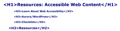
- Open ANDI and navigate to Structures.
- Use the forward and back arrows to move through all headings and view the ANDI Output.
- Are all visually apparent headings programmatically identified?
- Do the heading levels match the visual structure?
- Example:
H1will be the largest or most visually striking heading on the page, whileH2will be slightly smaller or more muted.
- Example:
Example of Section Headings
Solution
Using Aurora, identify headings using the built-in styles. The default style for all text is Paragraph. Use styles instead of emphasizing text with bold and italics. Outside of Aurora, define styles like H1, H2, etc. using CSS. These styles can be referenced as heading styles.
Instructions
- Look through the page for all places where sensory components, such as shape, size, visual location, orientation, and sound are used to convey information.
- Are instructions for understanding and operating content only provided using sensory information?
- If a user does not have access to a sense, will they still be able to understand and operate all elements of the page?
Solution
Provide multiple ways to access information. Do not make information rely on a single sense, as not all users have access to a sense. For example, provide both auditory and textual information for a video.
Instructions
- Look through the page for videos (without sound) or animations.
- Do all video-only files or animations have an equivalent text or audio description?
Solution
Provide equivalent text or audio descriptions for any video-only information or animations.
Website Managers
Instructions
- Tab through or use the arrow keys to navigate through the entire PDF, PowerPoint, or other presentation.
- Note: This does not apply to Word documents or emails.
- Note: You may have to enter presentation mode to tab through a presentation.
- Is the tab order logical?
- If the tab order is not logical, use the selection pane or Reading Order tool to reorder elements of the page.
- Refer to the [insert page (PDF)] and [insert page (PPT)] pages for further information.
Example of Keyboard Trap (illogical tab order)
The video shows a user tabbing through a calendar application. The user becomes stuck within the calendar and cannot move on to other parts of the page.
Solution
If an element can not be reached via keyboard controls only, the page’s tab order may need to be adjusted to include the element. If the website was designed in Aurora, contact the ITS Web Development and Design team for assistance at webdev@uconn.edu.
If an element does not receive visible focus when receiving mouse hover or keyboard focus, add :hover and :focus to the element’s CSS.
Website Developers
Instructions
- Look at the page to determine if there is content that updates automatically.
- Example: A counter ticking off the time until an event that updates every second.
- Is there a way for the user to pause, stop, hide, or control the frequency of automatically updating content?
- Does the page provide notification of each automatic update or change in content?
Solution
If user controls are available for automatically updating content, such as a counter ticking off the time until an event that updates every second, provide access to user controls. The user should be able to pause, stop, hide, or control the frequency of automatically updating content.
Furthermore, the page should provide notification of each automatic update or change in content. This can be done through a dialog box or another notification format. If user controls and notifications are not available, refrain from using the automatically updating content.
Instructions
- Look at the entire website to see if interactive elements are reused.
- Example: A “print page” button that appears at the bottom of every page of a website.
- Is the accessible name and description consistent for all components that perform the same function?
- Example: The “print page” button has the same name on each page and consistently causes the webpage to be printed.
Solution
If interactive elements are reused throughout a website, such as a “print page” button that appears at the bottom of every page of the website, ensure that the accessible name and description are consistent for all components that perform the same function. Using the “print page” example, the button would have the same name on each page and consistently cause the webpage to be printed.
Instructions
- Open ANDI and navigate to Focusable Elements.
- Use the forward and back arrows to move through all focusable elements and view the ANDI Output.
- Are all elements that should be focusable identified by ANDI?
- If they are not identified, the element will not necessarily receive visible keyboard focus.
- If a focusable element is not identified by ANDI, tab to the element to see if it receives visible keyboard focus.
- Are there any keyboard traps, where the user becomes stuck in an endless loop?
- Are all elements that should be focusable identified by ANDI?
Example of Keyboard Trap (illogical tab order):
Solution
If an element can not be reached via keyboard controls only, the page’s tab order may need to be adjusted to include the element. If the website was designed in Aurora, contact the ITS Web Development and Design team for assistance at webdev@uconn.edu.
If an element does not receive visible focus when receiving mouse hover or keyboard focus, add :hover and :focus to the element’s CSS.
Instructions
- Open ANDI and navigate to Structures.
- Under Structures, select More Details and click on Page Language.
- Does the page have a language declared?
- If languages other than the initially declared language are used in the page, is there appropriate markup to show this?
- Does the page have a language declared?
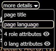
Example of Language Attribute
![language attributes shown at the top of uconn.edu. Language attributes read [html:en-US] [html:en-US]. Navigation bar reads Prospective Students, Students, Alumni, Visitors, Faculty & Staff, Business Partners. UConn banner reads UCONN University of Connectictut.](https://accessibility-its.media.uconn.edu/wp-content/uploads/sites/2398/2018/09/language-attributes-400x97.png)
Solution
If the page language is not declared, edit the page’s HTML to include a language attribute. For example, a page where the primary language is American English would have lang="en-US". In Aurora, the page language is automatically declared.
Instructions
- Open ANDI and navigate to Structures.
- Under Structures, select Lists.
- Are all visually apparent lists programmatically identified according to their type?
- Example: An unordered list will be programmatically identified using
<ul>.
- Example: An unordered list will be programmatically identified using
- Are all visually apparent lists programmatically identified according to their type?
Solution
Change any visually apparent lists into programmatically identified lists. Using Aurora, create lists using the bullets or numbering controls. Outside of Aurora, define lists using <ol> and <ul> element tags.
Instructions
- Are there two or more ways to get to each webpage in the site?
- Look at the entire website.
Solution
Provide more than one way to navigate to each webpage in a site. This can include providing menus and sitemaps.
Instructions
- Open ANDI and navigate to Structures.
- Under Structures, select More Details and click on Page Title.
- Does the page’s title reflect the purpose of the page?
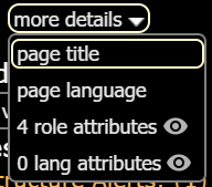
Example of Page Title
Solution
Using Aurora, provide a page title when creating or updating a page using the “Add Title” field at the top of the page editor. Outside of Aurora, use <title> to define the page’s title.
Instructions
- Open ANDI and navigate to Links/Buttons.
- Is there a method to skip repetitive content?
- Note: Skip links will typically invite the user to skip the navigation bar and move directly into the page’s main content.
- Is the skip link’s target located after the repetitive content?
- Think: If the skip link is meant to skip the navigation bar, does the target place the user at the top of the page’s main content?
- Does the skip link work properly?
- Is the relative order of repetitive content the same on each page?
- Example: The navigation bar the same on each page and contains the same content.
- Is there a method to skip repetitive content?
Example of Skip Link
Solution
Using Aurora, links allowing users to skip repetitive content like navigation bars will be provided. Outside of Aurora, add a link above the repetitive content whose target is the page’s main content. Check that the link works properly. Repetitive content, like navigation bars, should be in the same relative page on each page on which it is used.
Instructions
- Open ANDI and navigate to Hidden Content.
- Look at Accessibility Alerts.
- If content was injected using CSS, is the user experience impacted negatively if CSS is disabled?
Solution
Consider if content needs to be injected using ::before or ::after. If it’s not necessary for content to be presented in this way, modify content so that it is always visible. Otherwise, consider if users who disable CSS will still be able to access the hidden content. If they cannot, make content visible.
Instructions
- Determine if the page times out at any point.
- Example: An online user portal for a bank typically times out after 10 minutes and will alert you that your session is about to expire.
- Does the page time out without notification?
- Does the notification display for at least 20 seconds?
- Does the page provide an option to request more time?
Example of Time Out
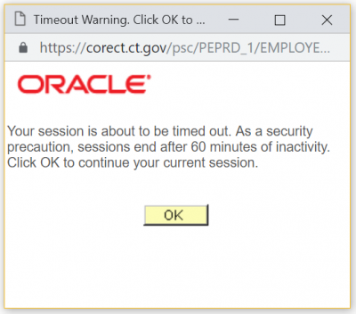
Solution
If a page times out, save the user’s information so that they can return to the page. Also, display a time out notification for at least 20 seconds and provide an option for the user to request additional time.