Table of Contents
About Image Accessibility
Accessible Images Best Practices
How to Make Images Accessible
- Images in Word & PowerPoint
- Images in Acrobat Pro
- Images in Websites
1. Introduction
“A picture is worth a thousand words.” While this is true for someone with their sight intact, visually impaired users who are unable to see the picture have a different experience and rely on words to describe images.
Describing images is perceived through alternative text, captions, or nearby bodies of text. Quality alternative text provides the information conveyed in the image, including all text seen in the image and relevant details. It can be difficult to choose where to focus your description and what to leave out, so here are a few rules of thumb:
- Is the image meaningful? If yes, it must include alternative text. The absence of one means that users who cannot see the image will miss important information. If the image lacks meaning, then it needs to be marked as decorative.
- What is the purpose of the image? Focus on how the image is relevant. Alt text needs to contain similar information for visually impaired users as what a sighted user sees.
- What is the image’s context? Context often tells us what aspects of the image are most important. An aerial image of UConn might be specifically focused on showing Gampel Pavilion, or it might be a general overview of our landscape.
- Does the image have a function? Images can enhance a user’s understanding of a particular function. A magnifying glass icon that serves as a search button should be described as a search button.
Watch this video on creating accessible images:
2. Alternative Text
Alternative text, or alt text, needs to be included in non-text elements such as images, icons, charts, and graphs so that they are perceivable by all users, particularly those with visual impairments. Alt text is a brief, descriptive text that is not visually displayed on the page but is programmatically associated with the image.
It is announced by screen readers to users who are blind or visually impaired, helping them understand the purpose or content of the image. Alt text also benefits sighted users when images fail to load, ensuring that the core message of the image is still conveyed.
When to Use Alt Text
- Informative images such as charts, product images, classroom discussions, etc.
- Functional images such as icons that serve as a link.
- An image that adds no additional information can be marked as decorative.
Benefits
- Supports screen reader users by conveying the purpose of images, icons, and charts.
- Improves comprehension when images fail to load or are blocked by the browser
- Enables equal access to visual information for people with visual disabilities.
3. Writing Effective Alt Text
- Keep it short (typically under 125 characters) while clearly describing the essential content or function of the image.
- Do not use these characters in your alt text: # % & ‘ ^ ` ~ + ; = ) ( \ / : * “ < > | [ ]
- Focus on what the image conveys rather than its visual details.
- Example: “Smiling student holding a certificate” instead of “A person with a blue shirt standing in front of a brick wall”.
- Do not include every detail of the image in the alt text.
- Do not repeat information already provided in surrounding text or labels.
- Example: Remove “Image of …” as screen readers identify images by default and announce them to users.
- If the image is a link or button, describe its function, not its appearance.
- Example: “Search” instead of “Magnifying glass”.
- Use empty
alt=""in code or check “Mark as decorative” in non-code for purely decorative images so screen readers skip them. - If your content can be understood by your users without the image then that image can be marked as decorative
- Avoid using decorative images as links.
4. Images in Word & PowerPoint
- Include only salient or key takeaway, not every data point.
- Example: “Line graph showing a steady increase in enrollment from 2015 to 2025.”
- Avoid repeating captions word-for-word unless they are critical for understanding.
- Alt text and captions should complement each other.
- Go to Review > Check Accessibility to find missing or incorrect alt text in Microsoft Word and PowerPoint.
- Please refer to the Writing Effective Alt Text above to learn more about writing accessible alt text.
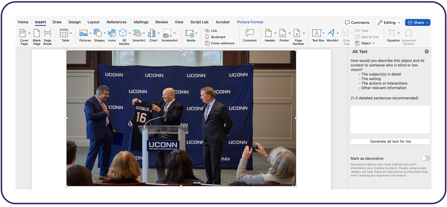
- Right-click on the image or object.
- Select “View Alt Text” from the context menu.
- Type a short, meaningful description of the image in the text box or use AI to generate the alt text, however double check to ensure it is accurate.
- If the image is decorative, check the box that says “Mark as decorative“.
- Your alt text is saved automatically.
It is paramount to note that we still need to verify AI-generated alt text thoroughly

5. QR Codes
Alt text for QR codes are very essential for users who are visually impairment and cannot visually scan the code and therefore rely on screen readers like NVDA and VoiceOver to access it.
Convey Purpose, Not Technical Description
- ❌ Avoid: “QR code”.
- ✅ Use:
<img src="qr-code.png" alt="QR code linking to our accessibility guide">oralt="Scan to access the accessibility resources page". - ✅ Example: “QR code linking to accessibility-guide”.
Avoid Vague Alt Text
- ❌ “Scan this QR code.”
- ❌ “Image with QR code.”

6. Charts & Graphs
Charts and graphs are visual ways to add information to your website. However, they can pose some difficulties for users with disabilities.
For example, users who are blind will be unable to see the chart and instead rely on screen readers to provide them with textual information about the chart. Users with mobility disabilities may be unable to use a mouse to hover over the graph, so they may need to be able to keyboard tab to each section of the graph.
There are a few things you can do to make your chart or graph more accessible to users with disabilities.
Add Brief Alt Text
Quality alt text provides the information conveyed in the image, including all relevant details. For example, a graph showing sale increases might have alternative text that reads, “Graph of sales 2017-2019, see table below for data”.
Utilize Nearby Text
In an adjacent paragraph or on a linked separate web page, describe the purpose and function of the chart or graph. Include an analysis of the data presented. For example, a graph showing sale increases may have a link to a longer description just beneath it. The link can be as simple as “Division Sales 2017-2019 text description of the graph”.
The description might read as follows: “This is a graph showing sale increases for the fiscal years of 2017 through 2019. In 2018, sales in Division 1 increased by 12 percent from 2017, while sales in Division 2 increased by 15 percent. From 2018 to 2019, Division 1 sales increased by 16 percent, and sales from Division 2 increased by 14 percent.”
Provide Data in Table Format
Tables are inherently more accessible than charts or graphs because users can tab or use the arrow keys to move through them. You can provide the table alongside the chart or graph, link to it, or offer a downloadable version of the table. The visualization plugin offers an option to select downloadable formats. Go to Advanced > Frontend Actions > Actions, then select Print, CSV or Excel. A table of sale increases may look like this:
| Sales | 2017 | 2018 | 2019 |
|---|---|---|---|
| Division 1 | 118 | 132 | 153 |
| Division 2 | 130 | 150 | 171 |
7. Moving Images
Animating images is becoming an increasingly popular practice regardless of the digital format. However, it’s important to maintain accessibility by keeping in mind the various users who will be accessing the content, especially for user who have cognitive impairments. What does this mean? It means ensuring images have reduced motion to avoid overwhelming distractions and triggering seizures.
Improving Accessibility
- Images moving endlessly in a horizontal carousel on websites should change at a slower pace.
- Avoid flashy animations on images that could hurt users’ eyes and trigger a seizure.
- Limit the number of moving images to only one action for less than 3 elements.
8. Logos & Wordmarks
In general, images serving as a logo or wordmark do not need to meet normal accessibility standards but require alternative text to convey its purpose. Logos can link to another web page either as a standalone image or as a group with text.
Although logos and wordmarks have minimal accessibility guidelines, it’s recommended to ensure they follow color contrast standards as brand colors often sample from logos. A logo with a tagline included or serving as a website’s brand identity may need to be seen more clearly.